HOW TO USE COLORS IN FILMMAKING
The COLOR PALETTE in a movie is what I like to call “Mood and Tone.” Every movie, TV show, or music video usually has an identifiable mood and tone or look to it. This is something that is consistent throughout the length of the presentation and/or shifts due to storytelling purposes.
“10 Best Uses of Color of All Time” by Cinefix © 2017 All Rights Reserved
This is a big aspect of being a filmmaker and understanding how colors can affect your audience. Underwhelming color choices can ultimately lead to a missed opportunity in your final piece.
Let’s discuss Color Archetypes for a little bit and how this can translate into your work as a filmmaker. Color Archetypes and how they visually stimulate audiences is heavily used in branding for clothing lines, food, electronic companies, automotive makers, and really any consumer products we utilize on a daily basis.
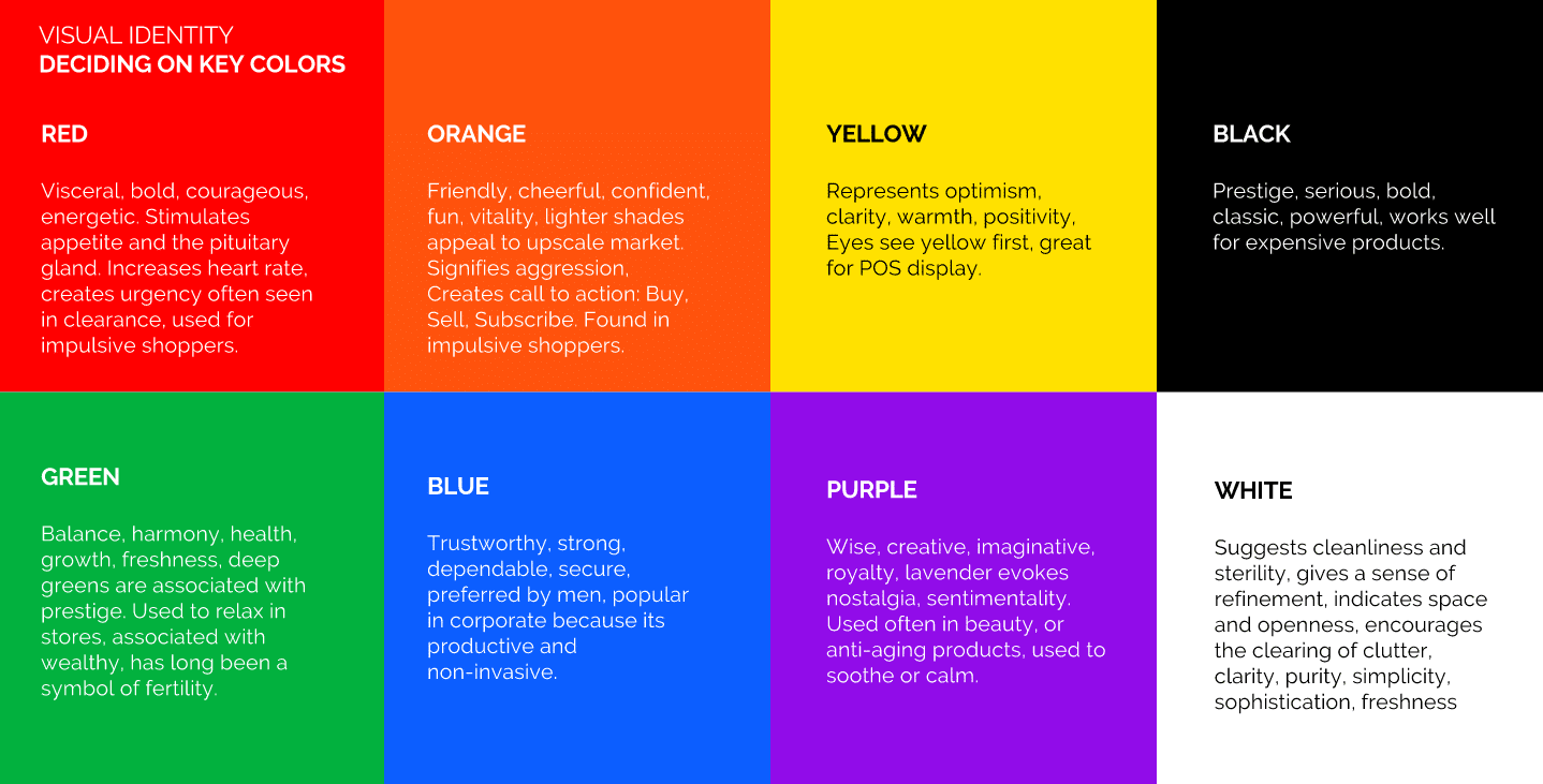
Marketing and branding teams across the world always review colors and how they affect the mood and tone of the product. What is the target audience? How should that target audience feel when looking at the product? In what capacity is the product meant to be used and what is the mood and tone suppose to be while using that product? While on a daily basis you might not consider the colors of a product critical, it is absolutely affecting you on a subconscious level.
Now imagine how colors can affect your audience on a subconscious level.
Thanks to the amazing website ARCHETYPES.com, I’ve pulled some of their color archetypes breakdowns to give you a better understanding of what colors can mean/express.
RED
Dramatic, energetic, brave, dangerous, determined, passionate.
Red is an extremely intense color. It symbolizes life – red is the color of blood, war and Mars. Simply looking at this color can enhance our metabolism, increase respiration rate and raise blood pressure. It makes us stop in our tracks. It is the color of a strong will and determination. It can awaken us – give us confidence and power.
Red is the color of sexuality and can stimulate hedonism. Being surrounded by too much of red can make us feel angry. Too little and we can become weak.
Resonates with Archetypes: Rebel, Royal, Athlete, Performer
GREEN
Fresh, organic, loyal, gentle, aware, earthy, secure, restful.
Green can span a variety of moods – it stands first for nature, but also renewal and rebirth, youth, jealousy, decay and money. We usually see it as a color for freshness; it is a restful color, it evokes stability and endurance. We use “green” to describe a novice and always for all-systems-go. It is a relatively friendly and positive color, the color of balance and harmony that gives us peace.
Being a combination of yellow and blue, green encompasses the mental clarity and optimism of yellow with the emotional calm and insight of blue, inspiring hope and a generosity of spirit not available from other colors. The color represents good judgment and prosperity.
Resonates with Archetypes: Advocate, Explorer, Spiritual, Intellectual
BLACK
Powerful, sophisticated, artistic, mysterious, guarded, serious.
Black is the color of mourning, of death and sorrow and doom and gloom, but it can also represent time and resurrection. Black is the ultimate in sophistication, in elegance and formality. It’s mysterious, sleek and intriguing, sometimes fearful and intimidating, but also strong and authoritative, even prestigious (black tie, the black Amex).
In color psychology this color gives protection, hiding vulnerabilities, insecurities and lack of self confidence. The color can imply seriousness, self-control, and discipline, a somber attitude in religious garb, an air of seduction in lingerie.
Resonates with Archetypes: Visionary, Tastemaker, Intellectual, Rebel
WHITE
Pure, innocent, good, clean, sterile, peaceful.
The color white has often been associated with innocence, purity, goodness and light, as well as the transcendent, faith and peace. It is cleanliness, sterile and pristine conditions; for winter, the cold and snow. The color is calming and orderly. It can purify your thoughts and clear your energy, but also can be a color of isolation, detachment.
When your life is taking a turn, whether you are moving or starting a new job, you may find a desire for white clothing, as it represents new directions and hope. The neutrality of white relaxes the eye, promotes calmness and balance.
Resonates with Archetypes: Spiritual, Visionary, Caregiver
YELLOW
Sunny, cheerful, joyous, happy, excited, inspired, creative.
Yellow, in the western world, is the color of sunshine, youth, joy and happiness. It is a sacred national color in China, and to the Buddhist, yellow is the color of humility. The color is warming, encourages mental activity and generates muscle energy, stimulating intellect and vigor. Yellow grabs your attention but can be overstimulating to infants.
In heraldry, yellow is used to indicate honor and loyalty. We now sometimes hear it used as a slang term meaning cowardice.
Resonates with Archetypes: Creative, Performer, Athlete
VIOLET
Rich, vibrant, powerful, artistic, eccentric, mysterious.
By combining the power of the color red with the cool wisdom of blue, violet is a delightfully mystical color. In meditation, focusing on violet can raise consciousness to higher levels. Associated with royalty, this color symbolizes power, nobility, luxury, ambition, wealth and extravagance. It also denotes respect, wisdom and dignity. There is a fair amount of creativity, mystery and magic in a streak of purple – and is the color that appeals most to children.
One of the rarer colors in nature, violet can be mistrusted and thought to be artificial.
Resonates with Archetypes: Royal, Creative, Visionary
BLUE
Tranquility, peace, calm, order, harmony, reliable, serene.
Blue is the color of intellect, peace and contemplation. It can represent water, the sky, and infinity. It is a cool, heavenly color, often associated with depth and stability; trust, loyalty and wisdom. The metabolism is slowed with blue, it is a color of utmost calm.
In heraldry, blue is used to symbolize piety and sincerity. While warm colors are emotional, blue is linked to consciousness and intellect. A strong blue is the preferred hue to indicate expertise and business, whereas light blue is associated with health, understanding and softness. Blue actually can suppress your appetite, and we frequently use the word “blue” to describe sadness or bouts of depression.
Resonates with Archetypes: Spiritual, Intellectual, Caregiver, Athlete
GOLD
Prestige, wisdom, wealth, knowledge, generosity, quality.
Gold is the ultimate in illuminated color. It can represent the sun, royalty, wealth and the divine. For the Egyptians, it was linked with Ra, the Sun God, and corn, upon which life depended. To the Hindu it was the symbol of truth. The ancient Greeks saw gold as the symbol of reason and immortality.
Optimistic and positive, gold adds richness and warmth to everything around it. It is associated with higher ideals, understanding and enlightenment. It inspires knowledge and spirituality; gold is generous and giving, compassionate and loving, the color of a benefactor. It is also the symbol of a winner – first place. It is confident, passionate and eye-catching, but can lead you to become egotistical and opportunistic in your quest for influence.
Resonates with Archetypes: Royal, Tastemaker, Performer, Spiritual
SILVER
Careful, modern, focused, articulate, technological, futuristic.
Silver is a very elegant, versatile color. It is both modern and hi-tech while also being alluring and sparkling. From a psychological perspective, silver is respectable and dignified, self-controlled and organized – unbiased with a sense of fairness and justice. Silver can remind us of aging gracefully; it is a light-hearted version of gray, it is an optimistically mature color. Silver illuminates and reflects the energy of those colors which surround it.
On the flipside, silver can also be aloof, indecisive and noncommittal. It is a cold neutral that can read as insincere.
Resonates with Archetypes: Performer, Explorer, Visionary
PINK
Compassionate, empathetic, sensitive, friendly, caring, grateful, fun.
Pink signifies romance, love, and friendship. It is an affectionate, intuitive and insightful color, symbolizing kindness and hope. It is a very positive color inspiring comfort and reassurance. Pink can alleviate feelings of anger and aggression; studies confirm pink has a calming effect and puts people in a nurturing mood.
Pink is non-threatening and appreciation-seeking. It can signify good health and gratitude. It is, of course, a sweet color and can indicate naiveté, but also feels very sentimental and cherished.
Resonates with Archetypes: Caregiver, Creative, Tastemaker
ORANGE
Enthusiasm, happiness, determination, attraction, success, encouragement.
Orange is a warm, social color; it is innately cheerful and playful. Orange combines the energy of red and the happiness of yellow, and it shares many of the same associations: joy, sunshine, passion and fun. It is a very hot, spicy color, so it gives the sensation of heat. It doesn’t read as aggressive, though, as it rather invigorates and stimulates mental activity. It is youthful; it can be representative of healthy food and appetite.
Orange also is the color of fall and harvest. In heraldry, orange symbolizes strength, power and endurance.
Resonates with Archetypes: Athlete, Creative, Advocate
BROWN
Stable, reliable, loyal, connected, earthy, organic, natural.
Brown is a friendly color, despite its reputation for being “boring.” It suggests stability, trustworthiness and dependability; it is practical, known for being honest, genuine, frugal and sincere. It relates to the hardworking, the industrious and reliable; brown is wholesome, natural and outdoorsy. Brown is structure, although not perfect – it encourages orderliness and organization.
Alternatively, brown can be sensual, sensitive and warm, engulfing one in a feeling of calmness and comfort. It values quality above all else, and everything in moderation. Brown suppresses the emotions, creating a safe haven from the stresses of the outside world within which problems can be contemplated and solved.
Resonates with Archetypes: Intellectual, Caregiver, Advocate
All content retrieved from Archetypes.com. Archetypes Authors. (Year of Publish Unknown). “The Archetype of Mystery: Color” Retrieved from URL – https://www.archetypes.com/archetype-mystery-color/
Understanding color archetypes takes time but it’s manageable when applied with common sense. Most of these you might know already because of how colors have been depicted in movies, on greeting cards, artwork, in advertisements, etc… We’ve all been manipulated by colors one way or another when it comes to the branding/marketing of the consumer world. Knowing this information gives you a better understanding on how it actually works!
You can see above that someone took EVERY single frame from the Close Encounters of the Third Kind and The Big Short and squished them together… What this helps depict is the fact that filmmakers like Steven Spielberg and Adam McKay are considering colors in their films. This shows the mixture of colors that complimented each other and came together to make that “mood and tone” or “look” of the final piece.
Now let’s talk about the process of applying your “look” or “color palette”:
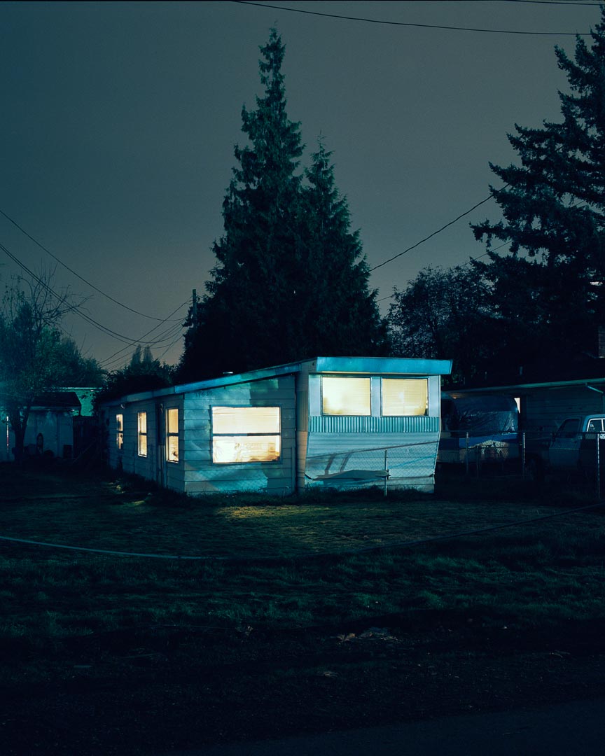
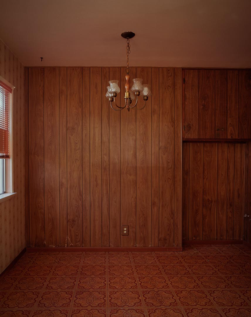
Now how do you select “mood and tone?” Well, that’s kind of done through the production designer, costume designer, the director, and the cinematographer. We all get together to discuss what we think the mood and tone should be of the film. For Need for Speed (2014), we used a still photographer called Todd Hido as our reference. His lighting is very naturalistic and he has very strong uses of color. He loves to work with cyan’s, blue tones, and very warm tobacco-golden tones.
With that palette, we got production design, wardrobe and everything together so we could lock in that “Need for Speed” look. From this, we created Toby Marshall and Aaron Paul’s world — his shop, his interior ,color of the walls, the paneling, etc… This also helped us figure out how we wanted to light the production. Hido does a great job of mixing light sources to create a very distinct look. We wanted to try the same with and interject that style into the film.
We didn’t want it to be a de-saturated world, we wanted people to feel alive, and their skin to have a vitality to it. When you were on the street it wasn’t just this mundane browns of sodium vapor and kind of flat. I wanted to capture that hyper-real look — right on the edge of being reality or being just a little too over the top. We rode that very thin line to bring this reality based story, as well as reality based driving and stunt, because we didn’t do hardly any CGI work in the film. We weren’t creating CGI cars or helicopters. We were putting the actors in the scene, in the moment, immersing the audience as if they were driving behind the steering wheel.
Throughout the film, we made multiple decisions that impacted the mood of the audience. Colors being the big factor in which we manipulated them. On your next production (whether it’s big or small), take time and go through the script scene-by-scene to see how you can manipulate the audience through colors. Does the overall film ask for a very stylized look? Something along the lines like Blade Runner? Does it call for a more realistic look? Something along the lines of a Noah Baumbach film? What does the script ultimately ask for? Just like any creative decision, you need to make sure you are basing your input off of the script. Help the story, don’t muddle it.
Get in there, play with some colors, and push the audiences to new worlds. If you can master this, you’ll be better than 90% of the filmmakers working today.
Peace,
-Shane Hurlbut, ASC
Posted on Hurlbut Visuals







One thought on “HOW TO USE COLORS IN FILMMAKING”
Furrealz? That’s maevolrusly good to know.